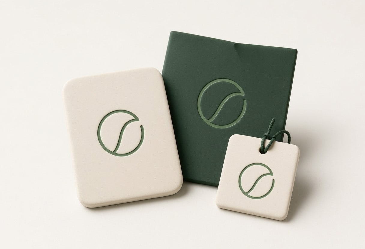
A professional brand does not need to be loud to be memorable.
In ten years of this work, most branding projects we take on turn out not to be about a new name. They are about settling how a firm describes what it does, then carrying that through everything a client looks at.
It suits practices whose presentation still reflects an earlier version of the business.
We work out who the practice is for and what it should be known for. That decision sits underneath everything else, and most firms have never written it down.
Describe it once
Partners often describe the firm differently, so the website settles on something vaguer than any of them. We agree the wording once and everyone uses it.
Build a system
Logo, colour and typography are set as a system with rules, not as one-off files. That is what keeps a proposal and a web page looking like the same firm.
Hand it over
You get the files and a short guide to using them, so the look holds up when someone in the office builds the next document. A brand nobody can apply quietly disappears.
Looking Like the Practice You Run
Most of the work is making the firm look and sound consistent with the reputation it already has.
Brand positioning
Core messaging
Logo development or refinement
Colour and typography systems
Everything built afterwards then has something to be consistent with.
What We Would Not Recommend Just for the Sake of It
A Rebrand Because the Logo Is Old
An older identity is not a poor one. It matters when it no longer represents the practice or creates inconsistency across what clients see.
A Name Change Without a Reason
The name carries referrals and recognition. Changing it costs both, and it should follow a merger or a real shift in the work.
Trend-Led Design
A look built on what is current this year will date, and a practice is judged partly on how settled it appears.
Guidelines Nobody Opens
A long brand manual helps no one if the person writing a proposal cannot find the file.
What Usually Needs Fixing First
1. The Message
Each partner describes the practice differently, so the site settles on something vaguer than any of them.
2. The Materials
Proposals, letterhead and the website each use a slightly different look.
3. The Mark
The logo was made for a smaller version of the business.
Start with How the Practice Is Described
You do not need a brief before getting in touch. Tell us how you describe the firm now, what has changed since the last update and where the two stop matching.
We can help you work out what deserves attention next.